Design That Welcomes Everyone Into Their Knowledge

Today we explore Accessibility-First Design Principles for Personal Knowledge Tools, transforming note-taking, bookmarking, outlining, and spaced-repetition spaces into environments where more minds can flourish. We move past checklists toward practical, humane choices that reduce friction for vision, motor, cognitive, and situational constraints. Expect actionable patterns, small design stories, and honest tradeoffs you can apply immediately. Join the conversation, share what works in your context, and help shape tools that respect time, attention, privacy, and dignity while unlocking deeper understanding.

Begin With Barriers You Can Remove

Design navigation so every action is reachable without a mouse: clear tab order, arrow-key movement in trees and outliners, and visible, high-contrast focus states that never hide behind animations. Provide shortcuts that are discoverable, remappable, and conflict-aware. Add skip links and landmark navigation to hop across panels. A researcher told us their best day was when rename fields stopped stealing focus mid-idea. That small fix turned a daily annoyance into momentum that stuck.
Structure content with semantic headings, lists, tables, and landmarks so assistive technologies can announce purpose, not decoration. Use ARIA thoughtfully to enhance, not replace, native semantics, keeping roles and names accurate and concise. Ensure reading order matches visual order and that live updates politely announce progress without interrupting thought. One writer said a simple aria-live message when sync completes removed the quiet stress of wondering whether changes were safe, restoring trust and flow.
Design for fluctuating stamina: autosave everything, avoid surprise timeouts, and offer offline-first reliability that tolerates weak connections. Provide gentle progress indicators instead of attention-grabbing spinners. Allow users to pause reminders, dim visual noise, and batch notifications. A student with long commutes reported that reliably picking up exactly where they left off, even after a tunnel, made reviewing flashcards feel supportive rather than precarious. Stability is care, and care turns into consistent learning.

Text, Contrast, and Calm Visual Rhythm

Readable typography and color systems lower cognitive load and reduce fatigue. Meet or exceed contrast guidelines, allow generous font sizing without layout breaks, and respect platform preferences for reduced motion and increased contrast. Use spacing, hierarchy, and consistent rhythm so scanning feels effortless. Allow dyslexia-supportive type options and line-length controls. When visuals stop demanding attention, users recover capacity for analysis, synthesis, and creativity, making each minute inside the tool more meaningful and restorative.

Structure That Guides Thinking And Finding

Information architecture shapes clarity. Use predictable navigation, clear labels, and stable locations for creation, review, and archive. Support multiple organizing strategies—tags, folders, backlinks—without forcing one mental model. Provide progressive disclosure: hide complexity until needed, then reveal it with purpose. Offer summaries, breadcrumbs, and consistent patterns for editing and preview. When structure respects human memory, people find connections faster, notice gaps sooner, and grow ideas through reliable paths rather than fragile leaps.

Input Without Friction Or Shame

Capturing ideas should feel safe, fast, and forgiving. Let people switch between typing, dictating, scanning, or pasting without mode confusion. Save drafts instantly and recover them gracefully after crashes or interruptions. Prefer prevention to scolding, and provide clear examples for formats. Make attachments and images accessible with prompted descriptions and quick keyboard workflows. When the tool supports imperfection, people capture more thoughts, earlier, preserving sparks that would otherwise vanish before they become knowledge.

Captions, Transcripts, and Summaries That Travel

Offer accurate auto-captions with easy correction tools and exportable transcripts that retain timestamps and speakers. Encourage adding alt text and structured summaries so shared artifacts work in inboxes, on phones, and with assistive technologies. Provide lightweight outlines for quick orientation before deep reading. Remote teams told us that transcripts enabled reliable asynchronous catch-up, dissolving time zones and hearing barriers, and that summaries sharpened purpose by clarifying what mattered before meetings even began.

Accessible Comments and Reactions

Make threaded conversations fully keyboard navigable with clear focus states, landmarks, and announceable actions. Ensure reactions and emoji have accessible names, not mystery icons. Provide filters and collapse controls that preserve context and reduce overload. Keep mention lists searchable and screen-reader friendly. In a study group, predictable comment behavior turned chaotic discussions into focused peer review. The result was less anxiety, better retention, and a kinder space where more voices felt safe contributing regularly.

Test, Iterate, and Keep Listening

Accessibility grows through relationships, not one-off audits. Schedule regular sessions with people who use screen readers, magnifiers, switch controls, voice input, and with those who manage migraines, ADHD, low bandwidth, or shared devices. Test on real content under real stress. Track regressions relentlessly and embed accessibility into acceptance criteria. Invite feedback visibly and respond respectfully. Iteration is stewardship: continuous improvements compound into trust, and trust compels deeper, more ambitious knowledge work.

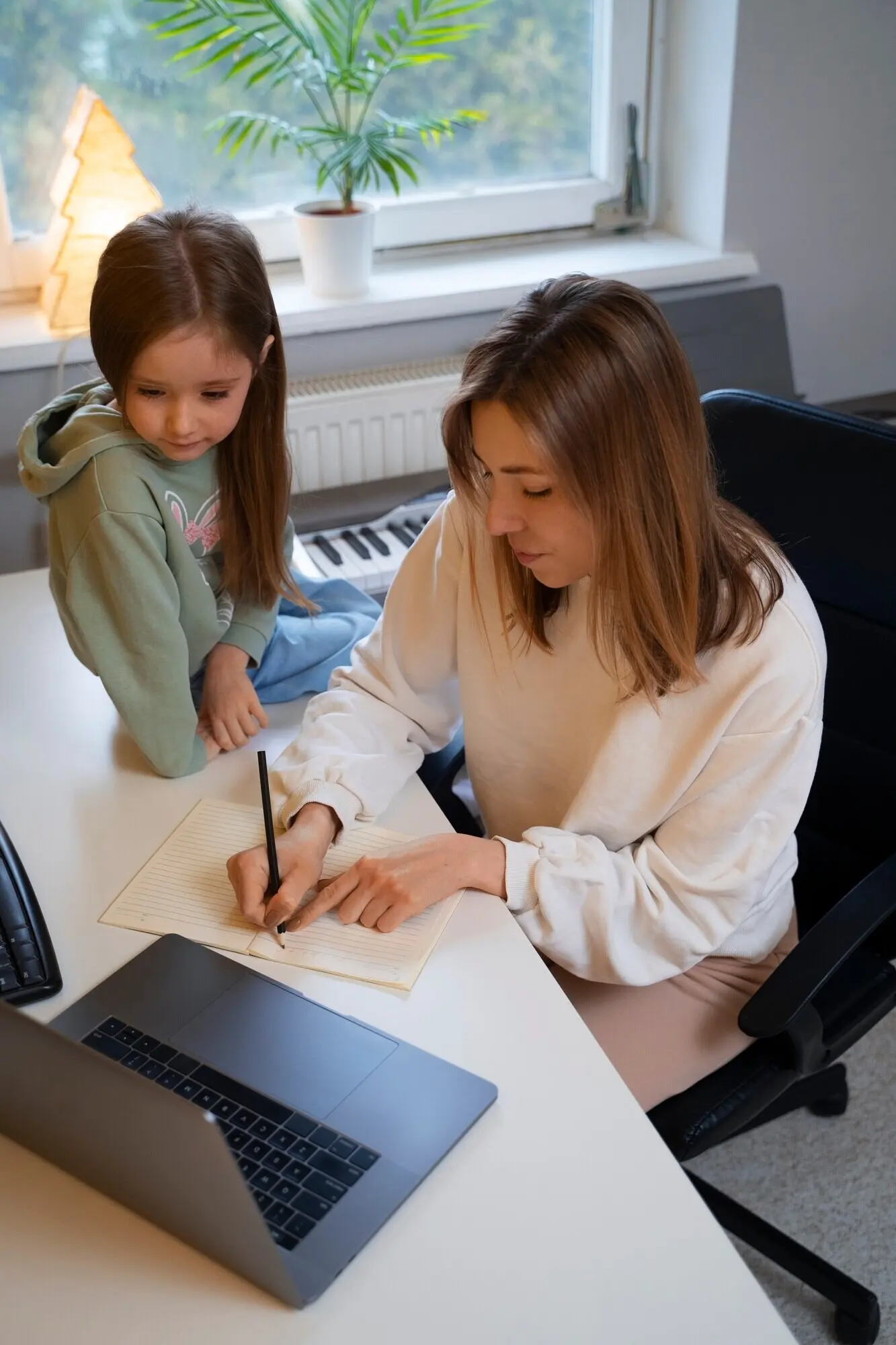
Real People, Real Devices, Real Contexts

Recruit broadly and compensate participants fairly. Observe how ideas are captured on buses, in libraries, and at kitchen tables with spotty Wi‑Fi. Watch for hesitation moments, not just outright failures. Pair lab checks with longitudinal studies that reveal fatigue and recovery patterns. A doctoral candidate shared that the most meaningful fix in months was a stable focus order during outline expansion, which reduced daily headaches and brought back the joy of refining arguments.

Metrics That Respect Humans

Measure task success, completion time, error recovery, and abandonment with context, not vanity numbers. Track how often users adjust font size, enable reduced motion, or rely on keyboard-only flows and treat these as first-class pathways. Watch for regressions when shipping new features. Publish improvements and admit misses. One team discovered that small latency reductions during save drastically cut duplicate entries for switch-control users, proving that performance and accessibility can be the same investment paying off twice.

Community Feedback Loop

Offer accessible channels for reporting issues and proposing enhancements, including email, public trackers, and captioned office hours. Close the loop by acknowledging reports, clarifying timelines, and sharing before and after examples. Maintain a changelog that highlights inclusive wins, inviting subscribers to test betas. Readers, tell us your hardest moment capturing or revisiting knowledge, and what worked. Your stories direct our next experiments and help shape tools that feel genuinely companionable in everyday study and work.

Zomipoxivelelakiniko
Privacy Overview

This website uses cookies so that we can provide you with the best user experience possible. Cookie information is stored in your browser and performs functions such as recognising you when you return to our website and helping our team to understand which sections of the website you find most interesting and useful.